Currency heatmap: how do you read each pair's risk before you enter?
Three questions decide whether an entry starts with a fair chance. A heatmap answers them per pair: scheduled releases, movement against normal and the crowded side.
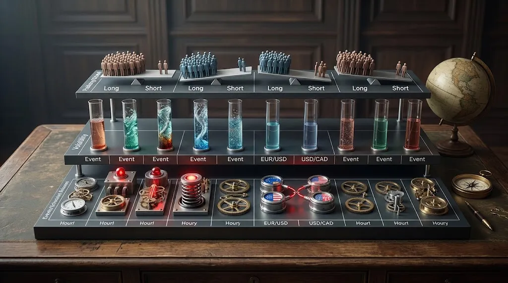
A chart tells you where price has been. Before an entry, three other questions decide whether the trade starts with a fair chance: is anything scheduled for either currency in the next few hours, is this pair moving more or less than it normally does at this hour, and which side is the crowd on?
A currency risk heatmap answers those three questions for every pair in one table. This article explains how to read each layer, and how to read them together. It will not tell you which way price goes next, because nothing in a heatmap does.
What a currency risk heatmap shows
Each row is a pair, usually grouped by the session in which it trades most. The columns split into three layers:
| Layer | What the cell shows | The question it answers |
|---|---|---|
| Events | The highest-impact release for either currency in the next 0–1 h, 1–2 h and 2–3 h | Is a shock scheduled? |
| Volatility | How much the pair is moving compared with its normal | Is there movement to work with? |
| Positioning | The long/short split of retail positions | Who gets squeezed if price keeps going? |
Colour does the rest: a red cell is a high-impact release, an empty one means nothing is scheduled. The value of the table is that you see all the rows at once, so the question stops being "is EUR/USD safe?" and becomes "which pair is cleanest right now?"
Layer 1: what is scheduled in the next three hours
Releases come with a timestamp, and the jump they cause happens around that minute. That is why the heatmap uses hourly windows instead of "today": a red cell three hours out and a red cell in the next 40 minutes ask for different decisions. The mechanics of that jump are in our piece on why price jumps on news.
Both currencies count. A US release hits every dollar pair, not just one. We measured it pair by pair over 67 non-farm payrolls (NFP) releases since 2021: the range in the release hour against the median of that same hour on the working days within 45 days either side.
| Pair | Range in the NFP hour vs a normal day |
|---|---|
| EUR/USD | 2.38 times |
| USD/JPY | 2.32 times |
| USD/CAD | 2.26 times (Canada's jobs report often comes out in the same hour) |
| USD/CHF | 2.23 times |
| GBP/USD | 2.10 times |
| EUR/GBP (no dollar) | 1.30 times |
Look at the last row. EUR/GBP carries no dollar and still moves 30% more than usual in that hour. A clear cell means nothing is scheduled for that pair's two currencies, not that the hour will be quiet.
A real example: Canada's jobs report on 9 October
Canada's employment report was due at 12:30 UTC (Coordinated Universal Time) on Friday 9 October, with ForexFactory's consensus at +6,100 jobs. It came out at −68,300, as our 10 October roundup covered.
An hour earlier, a heatmap would have shown the USD/CAD row red in its next window. The EUR/USD and USD/JPY rows had no high-impact release, only two medium-impact US surveys at 14:00, and EUR/GBP had nothing at all. Here is what each pair did in the 12:00–13:00 UTC candle on our feed, against the median of that same hour over the 114 weekdays from May to 8 October with data:
| Pair | Range that hour | Normal for that hour | Ratio |
|---|---|---|---|
| USD/CAD | 73.3 pips | 14.2 pips | 5.2 times |
| EUR/USD | 19.5 pips | 13.1 pips | 1.5 times |
| USD/JPY | 12.2 pips | 16.9 pips | 0.7 times |
| EUR/GBP | 4.2 pips | 6.1 pips | 0.7 times |
The red row moved five times its normal hour. The rows without a high-impact release did not. That is the whole point of the first layer: it tells you where the shock lands, not which way it goes.
With a release in the next hour, the news risk calculator turns it into a position size, and the economic calendar lists everything coming. For reading forecast against actual, see our guide to trading calendar news.
Layer 2: is the pair moving more or less than normal for this hour?
Volatility is a timetable, not a single number. EUR/USD peaks at 14:00 UTC with a median of 19.3 pips per hour and bottoms out at 6.4 between 22:00 and 23:00, and on a typical day the four hours of the London–New York overlap, 12:00 to 16:00 UTC, cover 61% of the day's high-to-low range (from our EUR/USD volatility profile). The reason is in our piece on session overlaps.
So "is it volatile?" only makes sense against the same hour. Six pips between 22:00 and 23:00 UTC, where the median is 6.4, is a normal EUR/USD hour; six pips at 14:00 UTC, where the median is 19.3, is a dead one. Our pair pages do that comparison live: today's range against what a normal day has done by this hour.
Two readings come out of this layer. A pair moving well above its normal has fuel, and also wider swings against your stop. A pair moving well below it may not reach a target that assumed a normal day.
To turn either into a stop distance, the tool is ATR (Average True Range), and the ATR method for sizing shows how.
Layer 3: which side is the retail crowd on?
Positioning is the split between long and short among retail traders' open positions. It comes from aggregators such as Myfxbook's Community Outlook, which builds it from the trading accounts its users connect to the site. Read through its API with the market closed on Saturday 10 October, it showed:
| Pair | Retail long | Retail short | Average entry of that side |
|---|---|---|---|
| EUR/USD | 78% | 22% | Longs at 1.1429, with the pair near 1.12 |
| USD/CAD | 4% | 96% | Shorts at 1.4072, with the pair near 1.4257 |
Source: Myfxbook Community Outlook.
Both crowds sat on the losing side: the average EUR/USD long had bought above where the pair closed, and the average USD/CAD short had sold below where it closed after Friday's jobs report.
The usual reading is contrarian: when the crowd is heavily one-sided, the side it is on is the one that gets squeezed if price keeps going, because its stops sit in the same place. Both our Market Readiness Score and the Forex Strength Index treat a crowded retail side as a contrarian input.
We have not measured whether that reading predicts direction, so read this layer as context, not as a signal. One more check costs nothing: a reading that stays identical for days while price moves is a broken feed, not a stubborn crowd.
How do you read the three layers together?
No single cell is a decision. The combinations are where the table earns its place:
| Events (next 3 h) | Volatility vs normal | How to read it |
|---|---|---|
| High-impact in 0–1 h | Any | The next hour belongs to the release. Wait, or cut size and widen the stop |
| High-impact in 1–3 h | Quiet | Do not read the quiet as a calm pair: the release has not happened yet |
| Clear | Above normal | Movement with fuel and no scheduled shock |
| Clear | Below normal | Little to work with; targets may not be reached |
Positioning sits on top of any of the four. A crowded side tells you whose stops would be hit if the move continues, which is worth knowing whichever direction you trade.
What a heatmap does not tell you
- Direction. All three layers describe conditions. None says whether price goes up or down.
- Unscheduled news. A headline, a central banker speaking off the calendar or a geopolitical event never appears in an hourly window.
- What happens inside the hour. An hourly cell hides the first minutes after a release, which is where the jump happens.
- The whole market. Positioning comes from the accounts an aggregator tracks. It is a sample, not the market.
- Your costs. Spreads widen around releases, and no column shows it.